Tinder dropped the gradient and started shouting
The pink to red gradient is gone, the wordmark is now heavy uppercase in a single flat red on black. A short read on the Tinder rebrand and why a logo change is a data problem.
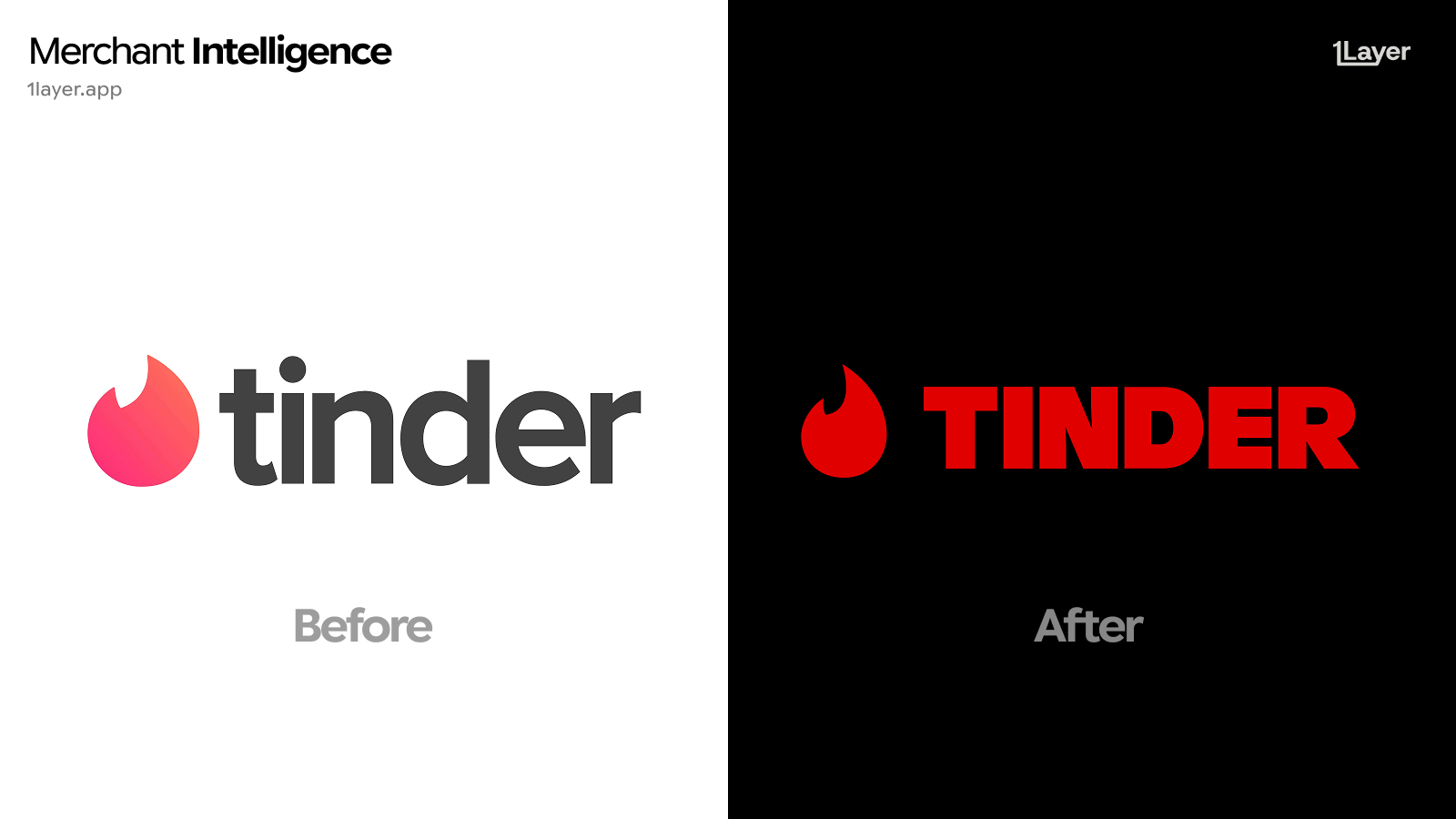
Tinder has flattened its flame. The pink to red gradient that defined the app icon for a decade is gone, replaced by a single flat red, and the friendly lowercase wordmark has been recut as heavy uppercase. The whole lockup now sits on black. It is the loudest version of the brand Tinder has ever shipped.
What changed in the new Tinder logo
- The gradient is gone. The flame is now one flat red instead of the pink to orange blend used since 2017.
- The wordmark moved from lowercase to uppercase, in a much heavier weight with tight letter spacing.
- The wordmark colour matches the flame. The old dark grey type has been dropped, so the mark reads as a single object.
- The flame itself is slightly rounder and simpler, with the notch cut cleaner so it holds shape at icon sizes.
- Dark first presentation: the lockup is shown on black by default rather than on white.
Lowercase and a gradient read as approachable. Uppercase in flat red reads as a statement. Tinder just stopped introducing itself politely.
Why Tinder changed it now
Gradients are the most fragile thing a brand can put in a logo. They band on cheap displays, they collapse into a muddy midtone at 24 pixels, they need a separate flat version for embroidery, print, and every partner style guide, and they cannot be recoloured without redrawing. Flattening to one red removes all of that maintenance in a single decision.
The uppercase shift is a positioning move rather than a technical one. Dating apps spent years signalling softness and low stakes, and the category has since split between casual and serious intent. A heavy uppercase wordmark is what a brand uses when it wants to be seen as a default, not as an experiment.
Why a logo change is a data problem
For a bank, wallet, or subscription tracker, a rebrand is not a design story. It is a freshness problem. Tinder is a high frequency subscription line: monthly plans, tier upgrades, and one off in app purchases, often billed through app store intermediaries rather than under the brand name. The day the mark changes, every cached copy of the old gradient flame in a transaction feed is wrong.
- A stale logo makes an otherwise correct transaction look neglected.
- Match Group brands settle under several acceptor descriptors and store billing entities, so the same asset has to update in more than one place at once.
- Subscription charges are exactly where customers look most closely, because that is the screen they open when deciding whether to cancel.
The takeaway
Tinder lands on the same 2026 pattern as everyone else: no gradient, one colour, higher contrast, and a mark drawn for a small dark app row. Gradient logos are the next wave to fall, so if your library still holds blended versions of consumer brands, assume several of them are already out of date.
Frequently asked questions
What is the new Tinder logo?
The 2026 Tinder logo is a flat red flame paired with a heavy uppercase wordmark in the same red, presented on a black background. It replaces the gradient flame and grey lowercase wordmark.
Did Tinder remove the gradient from its logo?
Yes. The pink to orange gradient has been replaced by a single flat red applied to both the flame and the wordmark.
Is the Tinder flame still the app icon?
Yes. The flame remains the primary symbol and is what most merchant logo libraries render in a transaction feed. It has been simplified and flattened rather than redrawn from scratch.
Why do brands drop gradients from their logos?
Gradients band on low quality displays, turn muddy below about 32 pixels, need separate flat versions for print and embroidery, and cannot be recoloured without redrawing the mark.
How do banking apps keep merchant logos up to date after a rebrand?
Either by manually curating a logo library, which drifts quickly, or by using a merchant enrichment provider that refreshes logos continuously and serves them at a consistent resolution.