Kia deleted the oval: the logo is now a single unbroken stroke
The new Kia logo removes the oval frame entirely and redraws the three letters as a single unbroken angular stroke, the reason so many people read it as "KN" at first glance.
Kia threw away the container. The red oval that had framed the brand name for decades is gone, and the three letters inside it have been redrawn as one continuous angular stroke that rises from left to right. It is one of the most aggressive identity changes any carmaker has made, because unlike most rebrands it does not simplify the existing mark. It replaces it.
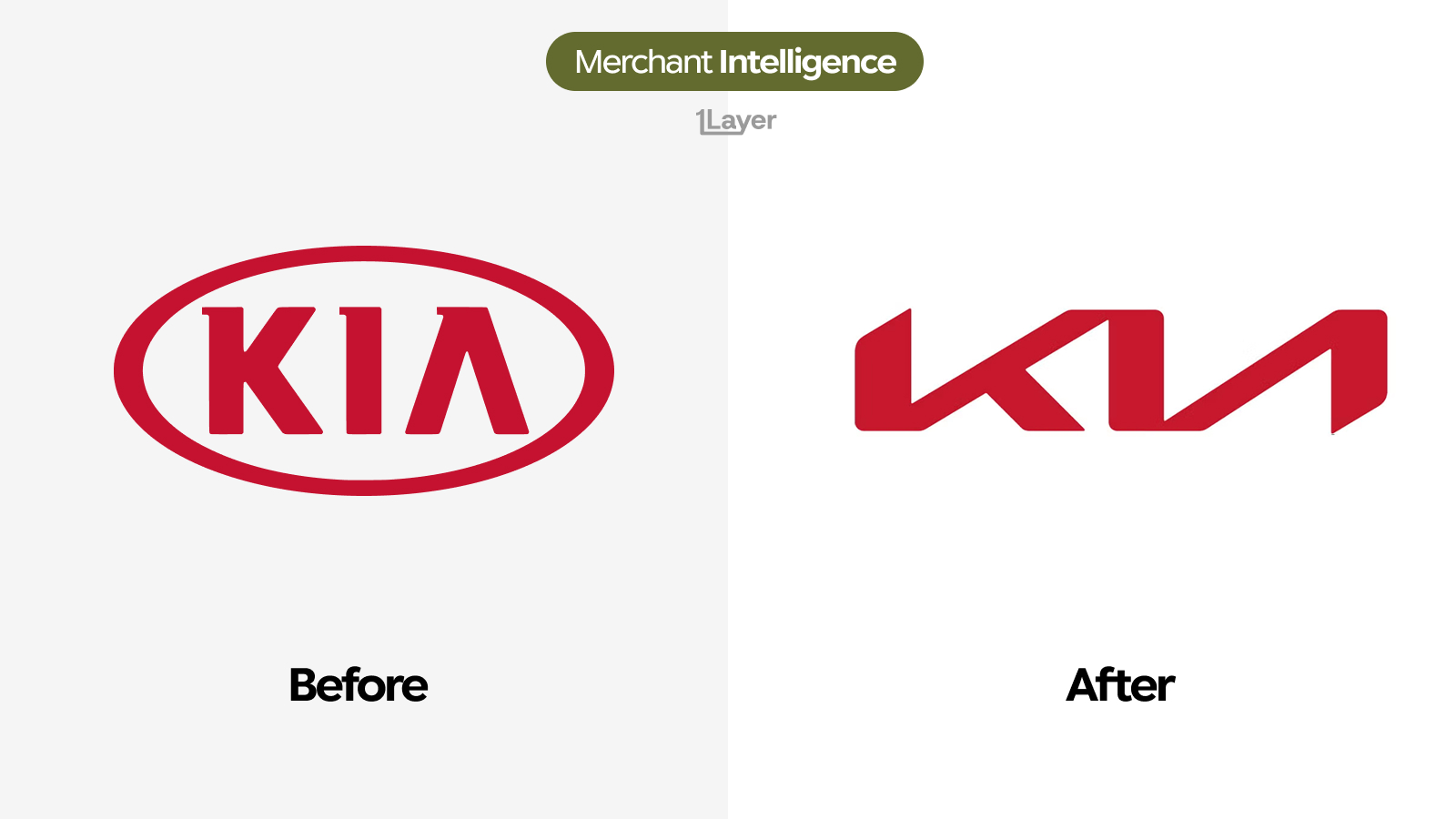
What changed in the new Kia logo
- The oval is gone. The mark no longer sits inside a frame, so it can stretch across a grille or a screen without a fixed container.
- The letters connect. Where the old badge set three separate characters, the new one runs them together as a single continuous path.
- Everything is angular. Curves have been replaced by straight cuts and sharp corners, with no rounded terminals anywhere in the mark.
- The "A" lost its crossbar and its apex, becoming a plain diagonal that flows straight out of the "i" stroke beside it.
- The mark rises. The whole logo tilts upward from left to right instead of sitting level inside an oval.
- The red survived, close to the old value, which is most of what carries recognition through a change this large.
| Before | After | |
|---|---|---|
| Frame | Red oval around the name | No frame at all |
| Letterforms | Three separate characters | One continuous connected stroke |
| Geometry | Rounded oval, curved letters | Fully angular, straight cuts |
| The "A" | Crossbar and apex | Plain diagonal, no crossbar |
| Baseline | Level inside the oval | Rises left to right |
| Colour | Kia red | Kia red, effectively unchanged |
Most rebrands protect legibility and change the styling. Kia did the opposite: it accepted a legibility cost to buy a mark nobody could mistake for another carmaker.
Why Kia took the risk
The old badge had a category problem. A name inside an oval was the default automotive lockup, close enough to several competitors that the mark did nothing for the brand beyond stating the name. The new one has no lookalike. It is closer to a signature than to a badge, and it reads as one gesture rather than as a word inside a shape.
The legibility cost is real and well documented: a meaningful share of people read the mark as "KN" the first time they see it, and it drove a wave of searches for what the letters actually say. Kia priced that in. Once the mark is learned it is unmistakable, and the searches themselves attach the brand to a moment of curiosity that a safer redesign would never have generated.
Dropping the frame is the practical half. A logo with no container scales into a thin horizontal strip on a grille, a square app tile, or a small transaction row without the surrounding oval eating the space the letters need.
Why a logo change is a data problem
For a bank or spend management product, a rebrand is not a design story. It is a freshness problem, and this one is worse than most because the old and new marks share almost no shapes. A stale Kia oval in a transaction feed does not look slightly out of date, it looks like a different company.
- Automotive brands reach card feeds through dealerships, service centres, parts, and finance payments, each under a different acceptor string.
- Dealer names rarely contain the manufacturer cleanly, so the logo often carries the recognition the descriptor does not.
- A mark this different from its predecessor makes stale assets obvious to any customer who has seen a current Kia on the road.
The takeaway
Kia made the trade most brands refuse: a short term legibility hit in exchange for a mark that belongs to nobody else. The red is doing the heavy lifting during the transition, which is why keeping it was the one conservative decision in an otherwise total redraw.
Frequently asked questions
What is the new Kia logo?
The new Kia logo removes the red oval entirely and redraws the three letters as a single continuous angular stroke that rises from left to right, keeping the brand red almost unchanged.
Why does the Kia logo look like it says "KN"?
Because the letters are connected into one path and the "A" has lost its crossbar and apex, so it reads as a plain diagonal. Joined to the stroke beside it, the "iA" can scan as an "N".
Why did Kia remove the oval from its logo?
A name inside an oval was the default automotive lockup and gave the brand no distinction. Removing the frame also lets the mark stretch across a grille or compress into a small app row without wasted space.
Did Kia change its brand colour?
No. The red is essentially the same value, and it is the main thing carrying recognition across a change that redrew everything else.
How do banking apps keep merchant logos up to date after a rebrand?
Either by manually curating a logo library, which drifts quickly, or by using a merchant enrichment provider that refreshes logos continuously and serves them at a consistent resolution.