The Google "G" lost its hard edges: four colours became one gradient
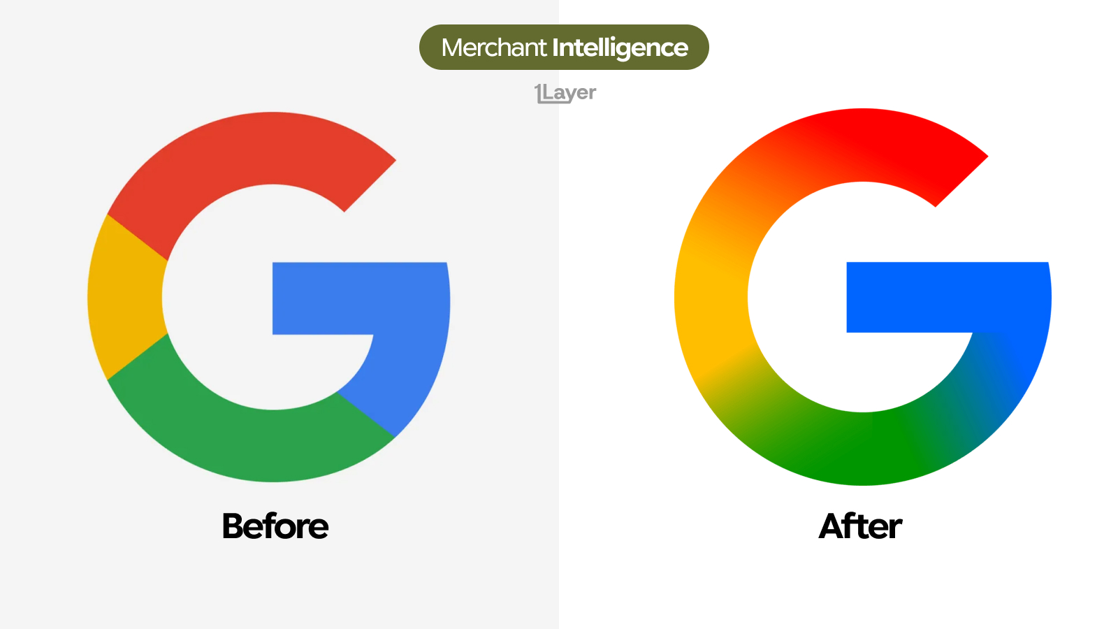
The new Google "G" keeps its letterform but drops the four blocks of colour, blending red into yellow into green into blue in one continuous sweep. The first real change to the mark since 2015.
Google has changed its "G". Not the shape, which is untouched, but the colour: the four hard edged segments that have defined the mark since 2015 have been dissolved into a single continuous gradient that runs red into yellow into green into blue around the ring. It is the first meaningful change to the icon in over a decade, and it is a strange one to make in 2026, a year most brands have spent removing gradients.
What changed in the new Google logo
- The hard colour boundaries are gone. Where red met yellow with a clean seam, the two now blend through orange.
- The colours run as one sweep around the ring: red at the top, yellow down the left, green across the bottom, blue up the right and into the crossbar.
- Every value is more saturated. The muted brick red and mid green have been pushed to a brighter, more luminous version of themselves.
- The blue now bleeds into the bottom of the ring, so the crossbar and the lower right arc read as one continuous piece rather than two segments.
- The letterform itself is unchanged: same weight, same terminals, same crossbar length, same aperture.
- The background reference moved from a light grey to pure white, which lets the brighter colours sit at full strength.
| Before | After | |
|---|---|---|
| Colour application | Four flat segments | One continuous gradient |
| Colour boundaries | Hard seams between each colour | Blended, no visible seam |
| Saturation | Muted brick red, mid green | Brighter, more luminous values |
| Crossbar | Separate blue segment | Blends into the lower right arc |
| Letterform | Unchanged | Unchanged |
| Small size behaviour | Four blocks stay distinct | Colours merge below roughly 24px |
The four colours were always a statement about parts. A gradient is a statement about one system with no seams in it.
Why Google changed it now
The four segment "G" was drawn for a flat design era and for a company that presented itself as a set of separate products. A blend says the opposite: one surface, no divisions. It also matches how Google has been styling its AI work, where sweeping gradients have been the house visual language for a while now. Pulling that treatment onto the primary mark closes the gap between the parent brand and the products it most wants associated with it.
The risk is small because the shape carries the recognition. The "G" silhouette with that particular crossbar is identifiable in one colour, in silhouette, at any size, which is exactly why Google can afford to experiment with the fill. The cost lands elsewhere: gradients band on low quality displays, need a flat fallback for print and embroidery, and blur into a single muddy hue somewhere below 24 pixels, where four distinct blocks stayed readable.
Why a logo change is a data problem
For a bank or spend management product, a rebrand is not a design story. It is a freshness problem, and Google is close to the worst possible case. Google charges appear across almost every card portfolio through Workspace seats, Cloud usage, Play purchases, One storage, YouTube subscriptions and ads spend, usually under acceptor strings that name the billing entity rather than the service.
- Almost every user has a Google line in their feed, so a stale icon is a portfolio wide problem rather than a niche one.
- One brand fans out across many descriptors, so the icon has to be correct on every mapped variant, not just the obvious one.
- Gradient marks are harder to cache cleanly than flat ones: a downsized copy that bands looks worse than no logo at all.
The takeaway
Google kept the one thing that matters, the letterform, and changed the one thing it could afford to lose. It runs against the flattening trend everywhere else in 2026, including inside Google itself, where the Play triangle went the other way, and it works only because the "G" is recognisable without any colour at all. Whether it survives small dark app rows is the part worth watching.
Frequently asked questions
What is the new Google logo?
The 2026 Google "G" keeps the same letterform but replaces the four hard colour segments with a continuous gradient that runs red into yellow into green into blue around the ring.
Did Google change the shape of the G?
No. The weight, crossbar, terminals and aperture are all unchanged. The only difference is how the colour is applied.
Why did Google switch to a gradient?
A blend reads as one continuous system rather than four separate parts, and it aligns the primary mark with the sweeping gradients Google already uses across its AI products.
Where does Google appear in transaction data?
Nearly everywhere: Workspace seats, Cloud usage, Play purchases, One storage, YouTube subscriptions and ads spend, typically under acceptor strings that name a billing entity rather than the specific service.
How do banking apps keep merchant logos up to date after a rebrand?
Either by manually curating a logo library, which drifts quickly, or by using a merchant enrichment provider that refreshes logos continuously and serves them at a consistent resolution.