
KFC put the wordmark back in red and cut the serifs
The new KFC wordmark is set in brand red instead of black, with heavier strokes, tighter spacing and the slab serifs trimmed away, so the letters work without the Colonel beside them.
KFC has redrawn the letters. Separate from the Colonel refresh earlier in the year, the standalone wordmark, the one that appears without the portrait beside it, has moved from a black italic slab to a heavier, tighter, brand red version with most of the serifs cut away. Same three letters at the same angle, but drawn to work on its own rather than as a caption underneath a face.
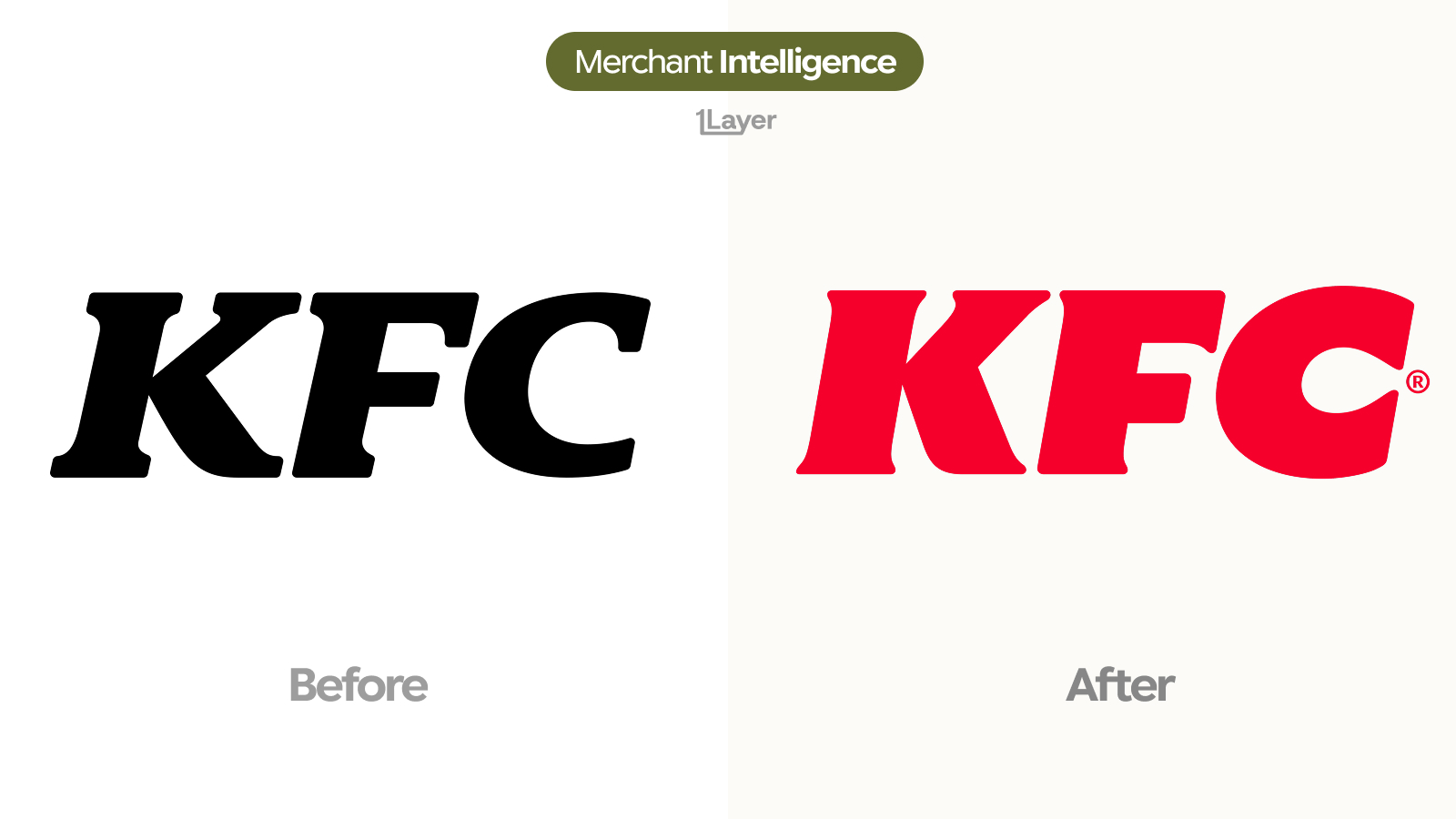
What changed in the KFC wordmark
- Black became brand red. The wordmark now carries the colour itself instead of relying on a red background or the Colonel mark to supply it.
- The serifs are mostly gone. The bracketed slabs on the "K" and "F" have been trimmed back to blunt terminals, leaving a much cleaner outline.
- The stroke weight went up across all three letters, so the counters are smaller and the mark holds more ink at small sizes.
- Letter spacing tightened. The three characters now sit closer together and read as one compact block rather than three separate shapes.
- The "C" is more closed, with a narrower aperture that stops the letter looking like an open arc when it is scaled down.
- The registered trademark symbol is now set small and high beside the "C", locked into the mark rather than floating.
| Before | After | |
|---|---|---|
| Colour | Black | KFC brand red |
| Serifs | Bracketed slab serifs on K and F | Trimmed back to blunt terminals |
| Weight | Medium, open counters | Heavier strokes, smaller counters |
| Spacing | Wide, three separate shapes | Tight, reads as one block |
| "C" aperture | Wide open arc | Narrower, more closed |
| Trademark symbol | Absent from the lockup | Set small and high beside the C |
A wordmark that only worked under a portrait is a caption. Colouring it and thickening it turns it into a logo that can stand alone.
Why KFC changed it now
The wordmark increasingly appears without the Colonel: delivery marketplace tiles, app rows, receipt headers, and in-app order confirmations rarely have room for the full lockup. In black, on white, with thin bracketed serifs, those letters carried none of the brand colour and lost their detail the moment they were scaled down. Making them red solves the first problem and cutting the serifs solves the second.
The tightening is the small size decision. Wide spacing looks confident on a roadside sign and turns into three drifting shapes in a 24 pixel row. Closing the gaps and closing the "C" gives the mark a single silhouette that survives compression, which is the same instruction behind the Colonel refresh earlier in the year, applied to the half of the identity that was left out of it.
Why a logo change is a data problem
For a bank, wallet, or expense app, a rebrand is not a design story. It is a freshness problem, and a wordmark-only change is the kind most easily missed. Nothing about the brand name or the Colonel moved, so an automated check comparing brand names finds nothing, while every cached copy of the black letters in a transaction feed is quietly out of date.
- A partial rebrand is easy to skip: the icon may still be right while the wordmark asset is wrong.
- Franchise and delivery variants mean the same brand appears under several acceptor strings, each needing the same updated asset.
- Manually curated logo libraries drift fastest exactly where consumer brands change most often: food, retail, and travel.
The takeaway
This is the second half of a rebrand that started with the Colonel. Red, heavier, tighter, fewer serifs, and a closed "C": all of it points at the same place, which is a small tile in somebody else's app. Worth noting for anyone maintaining logo assets, because the brand name did not change and nothing will flag this for you.
Frequently asked questions
What is the new KFC wordmark?
The 2026 KFC wordmark keeps the same italic three letter construction but is set in brand red instead of black, with heavier strokes, tighter spacing, trimmed serifs, and a more closed "C".
Why did KFC drop the serifs from its wordmark?
Bracketed slab serifs add detail that disappears or turns to noise below about 24 pixels. Blunt terminals keep the outline clean when the mark is scaled into an app row or a delivery tile.
Is this the same as the KFC logo change earlier in 2026?
It is related but separate. The earlier refresh flattened the Colonel Sanders portrait and tightened the red; this update redraws the standalone wordmark so it works without the portrait beside it.
Where does KFC appear in transaction data?
In consumer card feeds through in-store and drive-through purchases as well as delivery marketplaces, frequently under franchise operator names or aggregator descriptors rather than the brand itself.
How do banking apps keep merchant logos up to date after a rebrand?
Either by manually curating a logo library, which drifts quickly, or by using a merchant enrichment provider that refreshes logos continuously and serves them at a consistent resolution.