The Tennessee Titans put out the flames: inside the 2026 logo change
The comet tail is gone, the navy disc is now Titans blue, and a red ring frames the mark. A short read on the Titans rebrand and why a logo change is a data problem for anyone showing brands in an app.
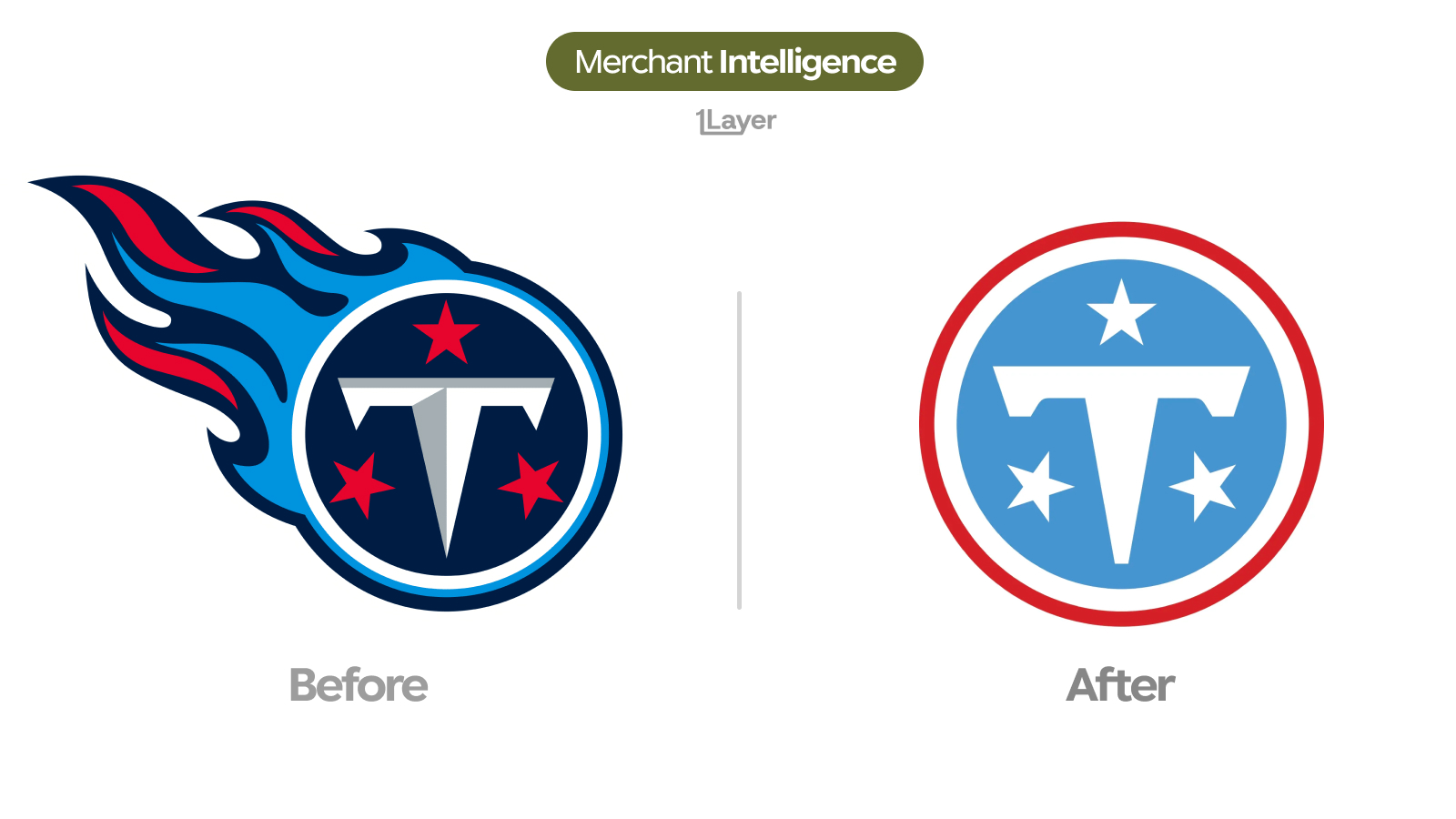
The Tennessee Titans unveiled a new logo and a new uniform set on the evening of 12 March 2026, announced first on the team’s own social channels. The flames are gone. What is left is a single disc: a redrawn white "T" on Titans blue, framed by a red ring, with three white stars for the three grand divisions of the state.
What changed in the new Titans logo
- The flaming comet tail that trailed the mark for over 25 years has been removed entirely, leaving a clean circular badge.
- The disc is now Titans blue, the lighter shade drawn from the Luv Ya Blue Oilers era, instead of navy.
- A red ring replaces the navy outline, and the three stars are now white rather than red.
- The "T" has been redrawn in flat white, dropping the metallic gradient of the previous version.
- A secondary mark, "The Football", pairs the letters TN with three stars inside a football outline.
Losing the flames costs the mark its silhouette and buys it a shape that survives a 24 pixel app row. That trade is the whole story of 2026 rebranding.
Why the Titans changed it now
The redesign is deliberately a continuation rather than a break. It leans on the light blue that fans already bought in throwback Oilers jerseys, and carries state references through the three stars and a six string stripe on the helmet, sleeve, and pants that nods to Nashville.
"I don’t think it’s a departure from anything," said Burke Nihill, President and Chief Executive Officer of the Titans. "It’s more of an evolution of the best of who we’ve always been and who we want to be going forward."
The timing lines up with a wider reset: a new coaching staff, a reshaped roster, and a new stadium on the way. The team ran the process across several years with fan, alumni, and player feedback through surveys and focus groups before landing on the final look.
Why a logo change is a data problem
For a bank, wallet, or expense app, a rebrand is not a design story. It is a freshness problem. Team brands show up in transaction feeds through ticketing, merchandise, concessions, and streaming subscriptions, usually under acceptor strings that do not spell out the club name. The moment the mark changes, every cached copy of the old flaming comet in a statement is wrong.
- A stale logo makes an otherwise correct transaction look neglected.
- Sports brands settle under several descriptors at once: box office, team store, stadium concessions, and third party ticketing.
- Manually curated logo libraries drift fastest where fans notice first, and a rebrand this visible is spotted within hours.
The takeaway
The Titans refresh follows the same 2026 pattern as the fintech and retail rebrands: fewer illustrative elements, higher contrast, and a shape drawn for the smallest place the brand appears. If a mark that survived 25 years on the side of a helmet can lose its flames, assume nothing in your logo library is stable and plan for continuous refresh.
Frequently asked questions
When did the Tennessee Titans change their logo?
The Titans unveiled the new logo and uniforms on 12 March 2026, announcing the change on the team’s social media channels.
Did the Titans remove the flames from their logo?
Yes. The flaming comet tail has been dropped. The new primary mark is a circular badge with a white "T" on Titans blue, a red ring, and three white stars.
What is Titans blue?
Titans blue is the lighter blue drawn from the Luv Ya Blue Oilers era, now used as the primary colour. The team says it is more distinctive than navy, which seven other NFL teams already use.
What is the new Titans secondary logo?
A mark the team calls "The Football": the letters TN, readable as NT for Nashville, Tennessee, alongside three stars inside a football shaped outline.
How do banking apps keep merchant logos up to date after a rebrand?
Either by manually curating a logo library, which drifts quickly, or by using a merchant enrichment provider that refreshes logos continuously and serves them at a consistent resolution.