Spotify’s disco ball logo is temporary: back to normal in 2027
The green circle is now a mirrored disco ball, but only for the anniversary year. Spotify reverts to the original mark in 2027, which means two logo swaps in twelve months for anyone caching brand assets.
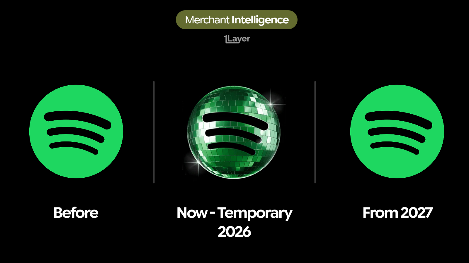
Spotify has changed its icon, but not for good. The flat green circle with three curved bars has been replaced by a mirrored disco ball, the same three bars cut across a faceted, light catching sphere. It is an anniversary mark: Spotify is running it for its 10th anniversary year and has said the original logo returns in 2027.
What changed in the Spotify logo
- The flat green disc has become a mirrored disco ball, built from small reflective facets with highlights and lens flares.
- The three curved bars survive untouched in shape and position, which is what keeps the icon recognisable at a glance.
- The green is no longer a single value. It now ranges from near white highlights to deep shadow across the sphere.
- The mark is dimensional rather than flat, the first time Spotify has shipped a primary icon with rendered depth in years.
- It is time boxed. Spotify has confirmed the standard flat green icon returns in 2027.
Why Spotify did it this way
An anniversary mark is a low risk way to celebrate. Spotify keeps the silhouette, the colour family, and the three bars, so nothing about recognition is put at stake, and the change lives entirely in surface treatment. Nobody has to relearn the icon, and the brand gets a year of visible difference without spending its equity.
It also runs against the direction of every other 2026 rebrand. The rest of the year has been about flattening: gradients dropped, detail removed, contrast raised for small dark app rows. A faceted, highlight heavy sphere is the opposite instruction. That is affordable precisely because it is temporary, and because the underlying shape does the recognition work even when the facets blur out at 24 pixels.
A permanent rebrand is one migration. A temporary one is two, and the second is the one everybody forgets to schedule.
Why a temporary logo is the harder data problem
For a bank, wallet, or subscription tracker, a rebrand is a freshness problem. A time boxed rebrand is a freshness problem with an expiry date attached. Spotify is one of the highest frequency subscription lines in consumer transaction data, so the icon sits in millions of feeds every month, and it now has to be correct twice: once when the disco ball ships, and again when it is retired.
- Teams that manually swap the asset this year have to remember to swap it back in 2027, usually without a ticket to remind them.
- A retired anniversary mark ages badly. Showing the disco ball in 2027 looks more neglected than showing the old flat icon does today.
- Spotify settles under several acceptor descriptors and app store billing entities, so both swaps have to reach more than one place.
- Family plans, tier upgrades, and annual renewals mean the same brand appears repeatedly in a single statement, so an out of date icon is not a one off sighting.
The takeaway
Treat this as two events, not one. The disco ball is live now and the flat green icon returns in 2027, which means any process that depends on somebody remembering to update an asset will be wrong at some point in the next eighteen months. Continuous refresh is the only version of this that does not need a calendar reminder.
Frequently asked questions
Is the Spotify disco ball logo permanent?
No. It is an anniversary mark for 2026 only. Spotify has said the original flat green icon with three curved bars returns in 2027.
Why did Spotify change its logo to a disco ball?
To mark its 10th anniversary. Keeping the silhouette and the three bars while changing only the surface treatment lets the brand look different for a year without risking recognition.
What is the new Spotify icon exactly?
The same three curved bars, now set on a mirrored, faceted sphere rendered with highlights and depth instead of the flat single green circle.
What happens to the Spotify logo in 2027?
It reverts to the original flat green mark, which means logo libraries need to handle a second change when the anniversary year ends.
How do banking apps keep merchant logos up to date after a rebrand?
Either by manually curating a logo library, which drifts quickly and is especially fragile for temporary marks, or by using a merchant enrichment provider that refreshes logos continuously and serves them at a consistent resolution.