Google Play dropped the cyan: the triangle is now a Google logo
The new Google Play icon keeps the four faceted triangle but drops the cyan and lime for Google's standard brand colours, with a shorter, wider silhouette and a rounded tip.
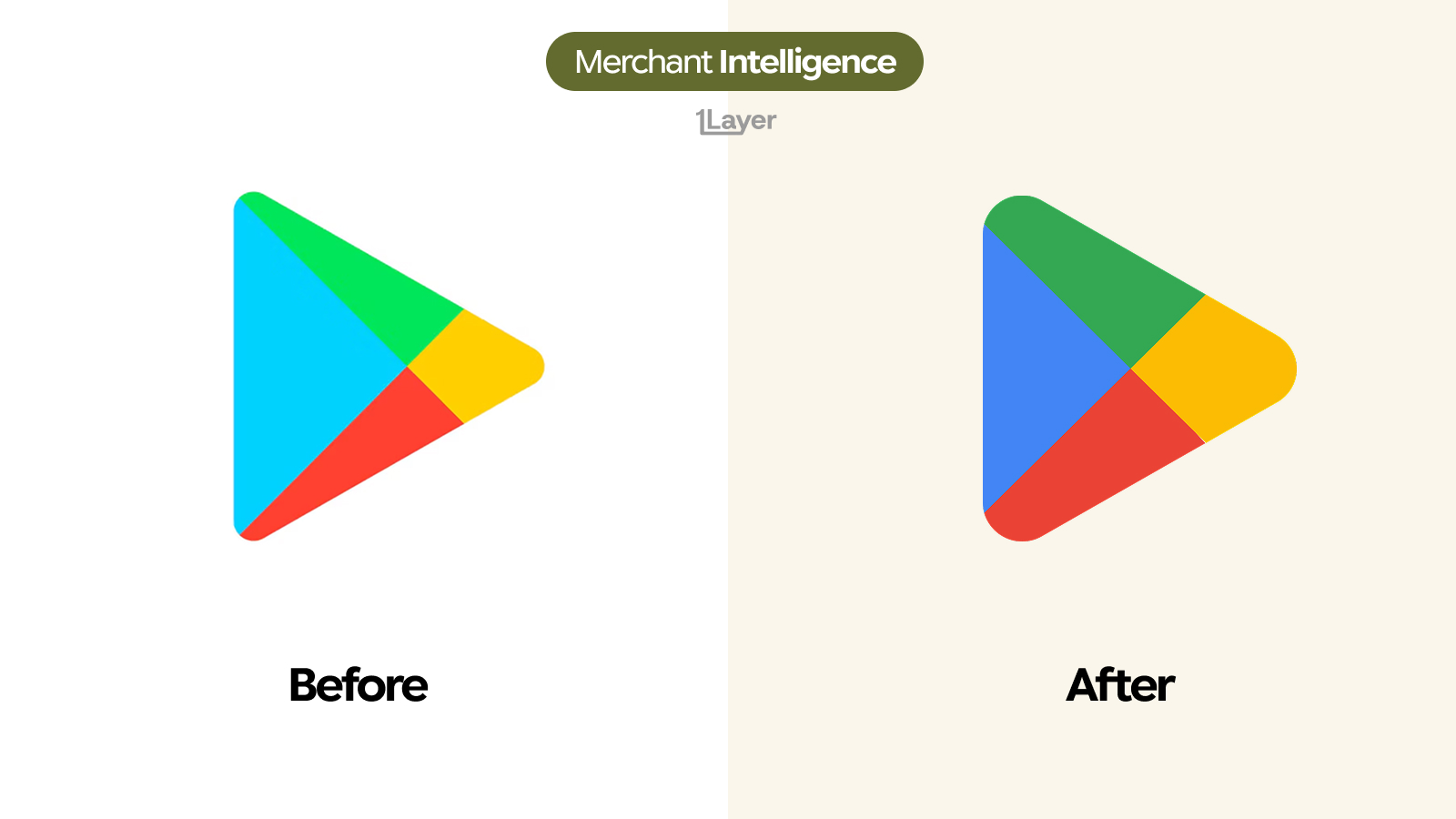
Google Play has redrawn its triangle. The play button shape stays, but almost everything else about it has moved: the cyan and lime palette that made Play the odd one out in Google's icon set has been replaced by the company's own blue, green, yellow and red, and the sharp elongated point has been rounded and pulled back into a squatter, friendlier silhouette.
What changed in the new Google Play logo
- The cyan is gone. The largest facet is now Google blue, the same blue used across Search, Maps and the rest of the product family.
- The lime green became Google green, a deeper and less electric value that no longer glows against the blue beside it.
- The yellow and red were pulled onto brand as well, so all four faces now come from a single official palette instead of a Play-only one.
- The proportions changed. The triangle is shorter and wider, with the tip retracted rather than stretched into a long point.
- The corner radius grew on all three corners, and the tip in particular is now a broad rounded cap instead of a near point.
- The internal seams stayed where they were, so the four facet layout and the fold illusion that reads as a paper plane are both preserved.
| Before | After | |
|---|---|---|
| Largest facet | Bright cyan | Google blue |
| Green facet | Electric lime | Google green |
| Palette source | Play-only colours from launch | The four official Google colours |
| Proportions | Tall and elongated | Shorter and wider |
| Tip | Near sharp point | Broad rounded cap |
| Facet layout | Four faces, folded read | Unchanged |
Play was the last Google icon still using its own colours. Bringing it in line costs nothing in recognition, because the shape was always doing the work.
Why Google changed it now
The old palette was a holdover. Play launched with a cyan to lime scheme that felt distinct in 2012 and increasingly looked like a different company by the time every other Google surface had settled on the four brand colours. Sitting next to Gmail, Maps and Drive on a home screen, the cyan was the loudest thing on the row and the one that did not belong.
The shape change is a small size decision. A long sharp point wastes the corners of an app tile and thins out to almost nothing at 24 pixels, where the anti-aliasing turns it into a fuzzy edge. A shorter triangle with a rounded cap fills the tile more evenly and holds its outline all the way down. Nothing about the fold or the four facets changed, which is why the icon still reads instantly as Play despite every colour in it being different.
Why a logo change is a data problem
For a bank or spend management product, a rebrand is not a design story. It is a freshness problem, and Google Play is one of the worst cases of it. Play charges land in consumer card feeds constantly, in small amounts, under acceptor strings that are usually some variant of a generic Google descriptor rather than the app or game that was actually bought.
- Play appears in more transaction feeds than almost any other merchant, so a stale icon is seen by nearly every user rather than a handful.
- Charges are frequent and small, which means the wrong mark is repeated many times a month in the same statement.
- Google descriptors are ambiguous by default, so the logo often carries most of the recognition work in the row.
The takeaway
This is a housekeeping rebrand, and a good one. Google kept the silhouette that people actually recognise, swapped a legacy palette for the one the rest of the company already uses, and softened the geometry for the size the icon is really viewed at. Low risk, and it removes the last visual seam between Play and everything else Google ships.
Frequently asked questions
What is the new Google Play logo?
The 2026 Google Play icon is the same four faceted play triangle, redrawn in Google's standard blue, green, yellow and red, with a shorter, wider silhouette and a rounded tip in place of the old sharp point.
Why did Google Play drop the cyan?
Cyan and lime were Play-only colours left over from launch and made the icon look out of place beside Gmail, Maps and Drive. Moving to the four official Google colours removes that inconsistency.
Did the Google Play icon shape change?
Yes, but subtly. The triangle is squatter and wider, all three corners have a larger radius, and the tip is now a broad rounded cap. The four facet layout and the folded paper plane read are unchanged.
Where does Google Play appear in transaction data?
In consumer card feeds as frequent small charges for apps, games, in app purchases and subscriptions, usually under a generic Google acceptor string rather than the name of the item bought.
How do banking apps keep merchant logos up to date after a rebrand?
Either by manually curating a logo library, which drifts quickly, or by using a merchant enrichment provider that refreshes logos continuously and serves them at a consistent resolution.