Instagram redrew its wordmark: the script is gone
The looping Billabong script is gone, replaced by an upright geometric wordmark with a single surviving curl on the "g". A short read on the Instagram rebrand and why a logo change is a data problem.
Instagram has redrawn its wordmark. The handwritten script that carried the brand since 2010, a direct descendant of the Billabong typeface used on the first app icon, has been replaced by an upright, geometric letterform with barely any handwriting left in it. For a logo that survived the 2016 icon change untouched, this is the bigger break of the two.
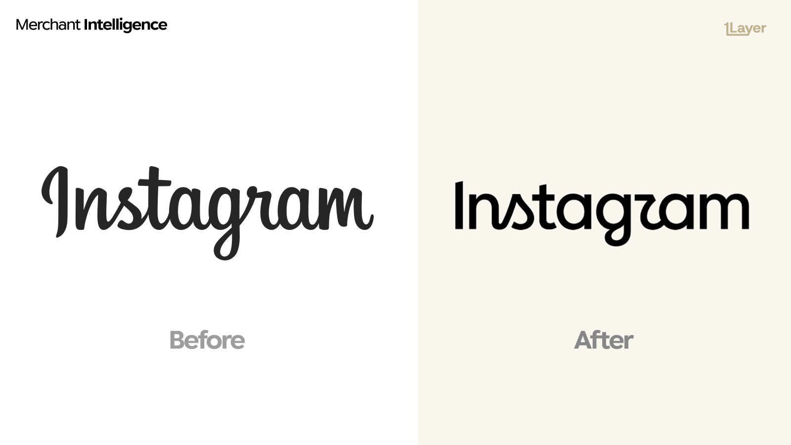
What changed in the new Instagram logo
- The connected script is gone. Letters now stand apart as individual shapes rather than flowing into one stroke.
- The letterforms are geometric and near-upright, closer to a rounded sans than to handwriting, with an even monoline weight.
- One nod to the old mark survives: the descending curl on the "g", kept as the single piece of brand memory.
- The capital "I" is now a plain vertical stem instead of the looped script capital, which removes the character most often misread at small sizes.
- It is set on a warm off-white rather than pure white, part of a softer palette rolling out across the app.
A script wordmark is a signature. A geometric one is a system. Instagram just moved from signing its name to shipping a component.
Why Instagram changed it now
Script wordmarks are expensive to maintain. They resist localisation, they blur when rendered under 32 pixels, they need a hand-drawn version for every alphabet the app supports, and they cannot be tracked, weighted, or set as UI type. A geometric wordmark can be extended into a family and reused across product surfaces, which is what most of the 2026 rebrands are really buying.
Why a logo change is a data problem
For a bank, wallet, or expense app, a rebrand is not a design story. It is a freshness problem. Instagram appears in transaction feeds constantly through ad spend, subscriptions, and in-app purchases, usually under Meta acceptor strings rather than under its own name. The day the mark changes, every cached copy of the old script sitting in a statement is wrong.
- A stale logo makes an otherwise correct transaction look neglected.
- Meta brands settle under several acceptor descriptors, so the same asset has to update in more than one place at once.
- Manually curated logo libraries drift fastest exactly where the biggest consumer brands change: social, retail, and travel.
The takeaway
If a mark as protected as the Instagram script can be retired, nothing in your logo library is stable. The 2026 pattern holds: less personality per asset, more consistency across surfaces, and letterforms drawn for a 24 pixel app row. Plan for continuous refresh rather than a one-off asset swap.
Frequently asked questions
What is the new Instagram logo?
The 2026 Instagram logo is a geometric, near-upright wordmark with evenly weighted letterforms, replacing the connected handwritten script used since 2010. The descending curl on the "g" is the one element carried over.
Did Instagram remove the script from its logo?
Yes. The looping script wordmark, based on the Billabong typeface, has been replaced by separated geometric letters. Only the curled tail on the "g" references the previous mark.
Why did Instagram change its wordmark?
Script wordmarks are hard to localise, hard to render at small sizes, and cannot be extended into a usable type family. A geometric wordmark can be reused as UI type across the product and across alphabets.
Did the Instagram app icon change too?
The change covered here is to the wordmark. The gradient camera icon remains the primary app mark, which is what most merchant logo libraries render in a transaction feed.
How do banking apps keep merchant logos up to date after a rebrand?
Either by manually curating a logo library, which drifts quickly, or by using a merchant enrichment provider that refreshes logos continuously and serves them at a consistent resolution.