
Cvent went serif and green: inside the 2026 rebrand
The blue "c" and the geometric sans are gone, replaced by a bright green serif on black. A short read on the Cvent rebrand and why a logo change is a data problem for anyone showing merchants in an app.
Cvent has changed direction. The geometric lowercase sans with the blue "c", the mark the event technology company carried through its growth into enterprise, has been replaced by a bright green serif wordmark set on black. It is a rare move: most software brands in 2026 are sanding detail off their logos, and Cvent has added some back.
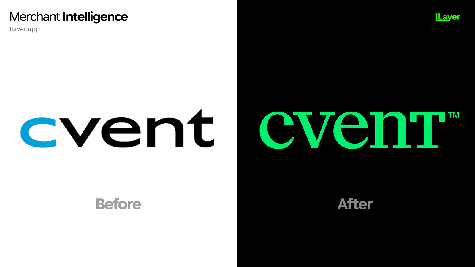
What changed in the new Cvent logo
- The wordmark moved from a geometric sans to a high contrast serif with bracketed serifs and visible thick to thin stroke modulation.
- The two tone treatment is gone. The old mark split a blue "c" from a black "vent"; the new one is a single colour throughout.
- The palette switched from corporate blue to a saturated spring green, chosen to hold up against black rather than white.
- The "t" is now drawn at cap height with a flat serif top, replacing the angled cut that used to close the old wordmark.
- Dark first presentation: the mark is shown on black by default, with the trademark symbol set small and high beside the final letter.
A serif in enterprise software is a confidence signal. It says the category is mature enough that the brand no longer has to look like a startup.
Why Cvent changed it now
Geometric sans wordmarks became the default across B2B software over the last decade, to the point where the category is close to interchangeable at a glance. A serif is the cheapest way out of that sameness, and a high contrast one reads as editorial and premium rather than as another SaaS dashboard. The green does the same job the letterforms do: it is a colour almost nobody in event technology or travel booking currently owns, where blue is crowded.
The dark first lockup is the practical half of the decision. Product surfaces, conference screens, and app rows increasingly render on dark backgrounds, and a saturated green survives that context where a mid blue turns muddy.
Why a logo change is a data problem
For a bank, expense tool, or spend management product, a rebrand is not a design story. It is a freshness problem. Cvent sits squarely in corporate card data through event registrations, venue sourcing, and software subscriptions, usually under acceptor strings that do not look like the brand name. The day the mark changes, every cached copy of the old blue wordmark in an expense report is wrong.
- A stale logo makes an otherwise correct transaction look neglected.
- B2B brands settle under several descriptors at once: annual subscriptions, per event registration charges, and reseller billing entities.
- Manually curated logo libraries drift fastest on software vendors, because nobody outside the finance team notices the mark is out of date until an approver does.
The takeaway
Cvent cuts against the 2026 grain on style and follows it exactly on substance: a single colour, high contrast, drawn to sit on dark, and simple enough to survive a small app row. Expect more enterprise brands to reach for serifs as a way to look distinct, and plan your logo library for continuous refresh rather than a one off asset swap.
Frequently asked questions
What is the new Cvent logo?
The 2026 Cvent logo is a single colour serif wordmark in a bright green, presented on a black background, replacing the previous geometric sans wordmark that used a blue "c" alongside black letters.
Why did Cvent switch from a sans serif to a serif?
Geometric sans wordmarks are the default across B2B software, which makes brands hard to tell apart. A high contrast serif reads as editorial and established, and separates Cvent from the rest of the category.
Did Cvent change its brand colour?
Yes. The blue accent has been dropped in favour of a saturated green applied across the whole wordmark, chosen to hold contrast on dark backgrounds where mid blue tends to sink.
Where does Cvent appear in transaction data?
Mostly on corporate cards, through event registration fees, venue sourcing, and software subscriptions, often under acceptor strings that do not spell out the brand name.
How do banking apps keep merchant logos up to date after a rebrand?
Either by manually curating a logo library, which drifts quickly, or by using a merchant enrichment provider that refreshes logos continuously and serves them at a consistent resolution.