Calendly closed the C: the 2026 logo is an app icon first
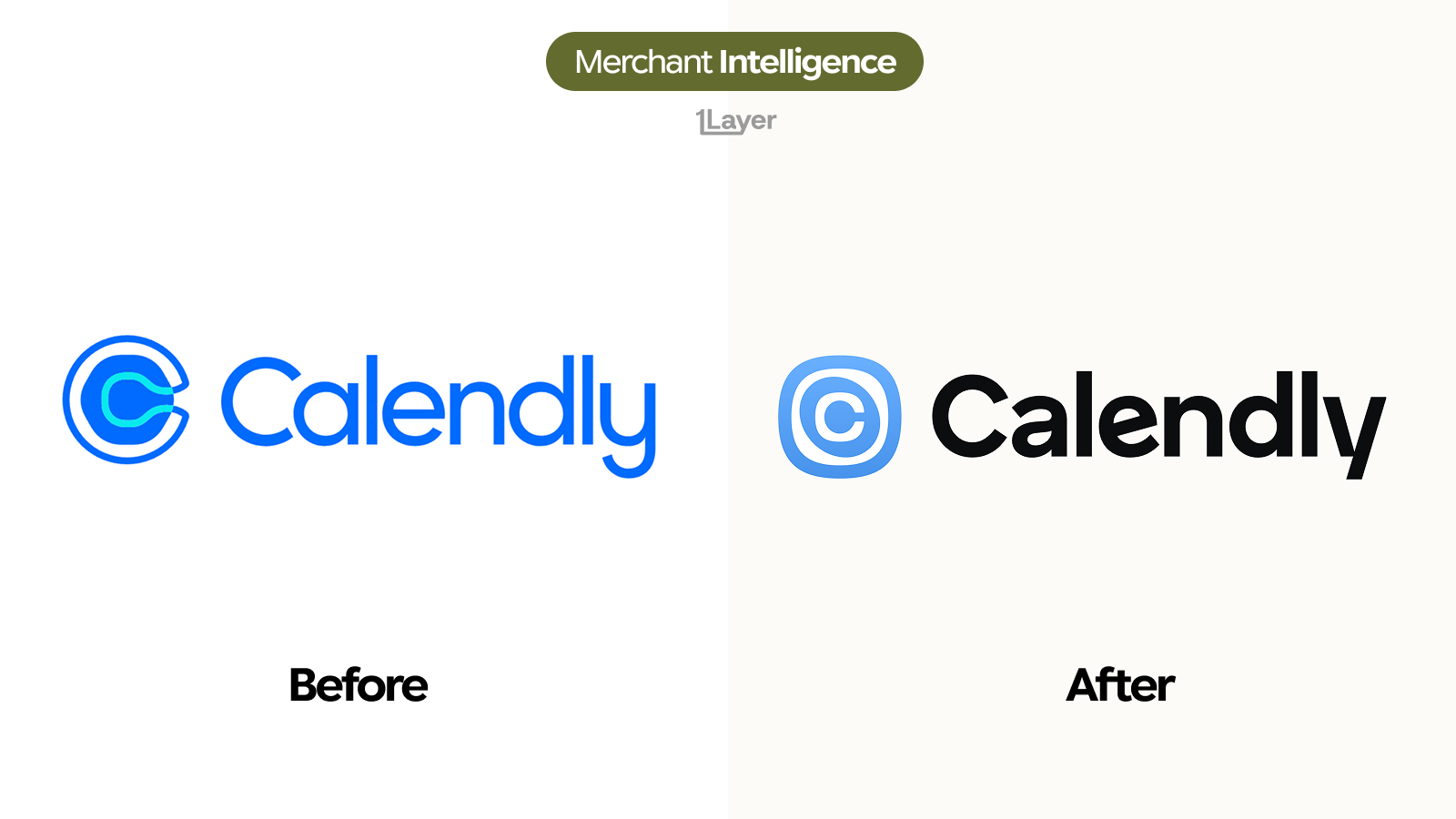
The new Calendly logo drops the open arc and the cyan accent for a closed squircle with concentric rings, paired with a black wordmark. A mark drawn for a home screen rather than a header.
Calendly has redrawn its mark. The open blue "C" with the cyan hook running through it, the icon the scheduling company has carried since it became a default tool in every sales and recruiting stack, is now a closed squircle with concentric rings inside it. The wordmark changed too: the same rounded geometric letterforms, but heavier, tighter, and set in black instead of Calendly blue.
What changed in the new Calendly logo
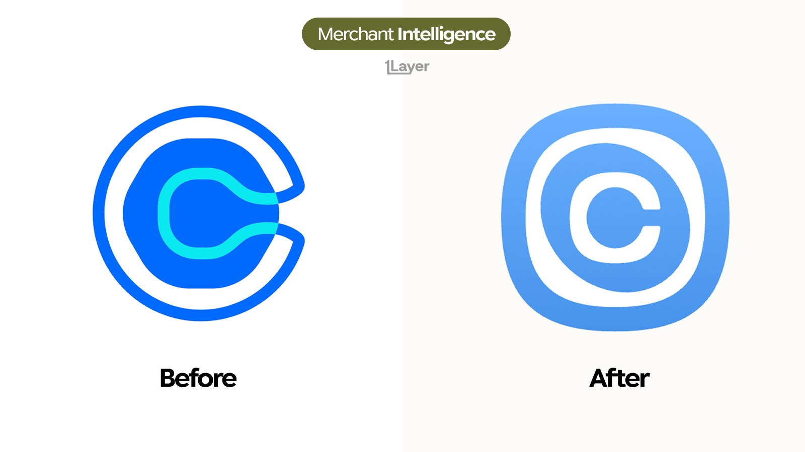
- The outer ring is closed. The old mark left a gap on the right where the arc stopped short; the new one is a continuous shape with no opening.
- The circle became a squircle, a rounded square silhouette that fills an app tile instead of floating inside it.
- The cyan accent is gone. The old icon layered three tones, deep blue, mid blue, and a bright cyan hook; the new one runs a single blue with a soft gradient.
- The blue lightened considerably, from a saturated primary to a paler sky tone that carries the gradient without banding.
- The interior is now concentric: a white ring, then a blue ring, then a clean "C" counter at the centre, so the letter reads as a nested target rather than a single stroke.
- The wordmark moved from Calendly blue to black and picked up weight, with tighter spacing and a flatter, more geometric "y" tail.
| Before | After | |
|---|---|---|
| Icon silhouette | Circle with an open gap on the right | Closed squircle, no opening |
| Icon colours | Deep blue, mid blue and bright cyan | One lighter blue with a soft gradient |
| Interior | Single cyan hook through the C | Concentric white and blue rings |
| Wordmark colour | Calendly blue | Black |
| Wordmark weight | Regular, wider spacing | Heavier, tighter spacing |
| Optimised for | Full lockup in a header | App tile and small transaction row |
An open letterform is a logo. A closed squircle is an app icon. Calendly just optimised for the grid it actually lives on.
Why Calendly changed it now
The old icon had a small structural problem: the gap in the arc. At full size it was a deliberate piece of character, but shrunk into a 24 pixel calendar invite or a browser tab it collapsed, and the cyan hook blurred into the blue behind it. Closing the ring and dropping to one colour removes both failure modes at once. What is left is a shape that survives any size because it is built from nested circles rather than from a broken stroke.
Switching the wordmark to black is the other half of the same decision. It lets the icon own the colour and the wordmark own the reading, which is the standard arrangement for brands that appear more often as a tile than as a full lockup. It also makes the mark portable: a black wordmark sits on any background, where a blue one always needs checking.
Why a logo change is a data problem
For a bank, expense tool, or spend management product, a rebrand is not a design story. It is a freshness problem. Calendly sits in card data through monthly and annual seat subscriptions, usually charged to a corporate card by a team lead rather than procurement, and often under an acceptor string that does not spell the brand out cleanly. The day the mark changes, every cached copy of the old blue "C" in a transaction feed is wrong.
- A stale logo makes an otherwise correct transaction look neglected.
- SaaS seats renew monthly, so the wrong mark is shown to the same user again and again rather than once.
- Manually curated logo libraries drift fastest on software vendors, because nobody outside the finance team notices the icon is out of date until an approver does.
The takeaway
Calendly kept the letter and threw away everything that made it fragile. One colour instead of three, a closed silhouette instead of an open one, and a black wordmark that stops competing with the icon. It is the same instruction most of 2026 has followed: draw for the smallest surface first, and let the full lockup take care of itself.
Frequently asked questions
What is the new Calendly logo?
The 2026 Calendly logo is a closed squircle icon in a light blue gradient, with concentric white and blue rings forming a "C" at its centre, paired with a heavier black wordmark in place of the previous blue one.
Why did Calendly close the gap in its "C"?
The open arc broke down at small sizes, where the gap and the cyan accent blurred together. A closed, nested shape stays legible in a browser tab, a calendar invite, or an app row.
Did Calendly change its brand colour?
It simplified it. The deep blue and bright cyan pairing has been replaced by a single lighter blue with a soft gradient, and the wordmark moved from blue to black.
Where does Calendly appear in transaction data?
Mostly on corporate and business cards as recurring monthly or annual seat subscriptions, frequently charged by individual team leads rather than through central procurement.
How do banking apps keep merchant logos up to date after a rebrand?
Either by manually curating a logo library, which drifts quickly, or by using a merchant enrichment provider that refreshes logos continuously and serves them at a consistent resolution.