
KFC has a new logo: what changed and why it matters for merchant data
A flatter Colonel, a tighter red, and a wordmark drawn for 24px app rows. A short read on the KFC rebrand and why a logo change is a data problem for anyone showing merchants in an app.
KFC rolled out a refreshed brand identity at the end of June 2026. It is an evolution rather than a reinvention: the Colonel stays, the red stays, but almost every line has been redrawn for screens rather than for signage.
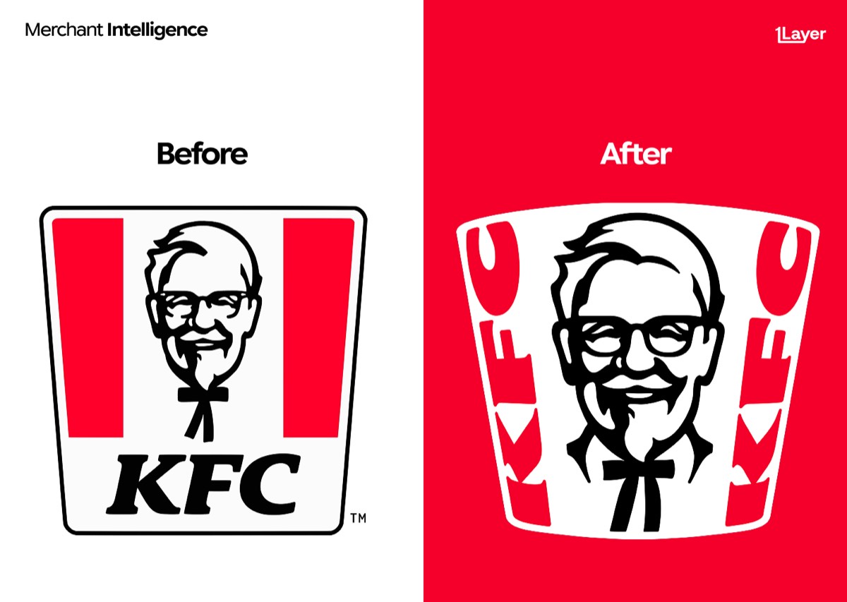
What changed in the new KFC logo
- A flatter Colonel Sanders portrait, with fewer engraved lines and higher contrast so the face still reads at small sizes.
- A tighter, slightly deeper red, applied consistently across packaging, app, and storefront rather than drifting between them.
- A redrawn wordmark with wider letter spacing and a heavier stroke, tuned for dark backgrounds and low-resolution placements.
- A simplified square avatar lockup for app icons, delivery marketplaces, and social profiles.
The brief for most 2026 refreshes is the same: the logo now lives in a 24 pixel row inside somebody else’s app, not on a roadside sign.
Why a logo change is a data problem
For a bank, wallet, or expense app, a rebrand is not a design story. It is a freshness problem. The moment KFC ships a new mark, every cached copy of the old one in every transaction feed is wrong, and customers notice long before anyone files a ticket.
- Stale logos make a statement look neglected, even when the underlying data is correct.
- Franchise and delivery variants mean the same brand can appear under several acceptor strings, each needing the same updated asset.
- Manually curated logo libraries drift fastest exactly where consumer brands change most often: food, retail, and travel.
The takeaway
The KFC refresh is a good example of the pattern behind most 2026 rebrands: less detail, stronger contrast, and assets drawn for the smallest place the brand appears. If your product shows merchant logos, assume a handful of your best known brands will do the same this year, and plan for the refresh rather than the redesign.
Frequently asked questions
When did KFC change its logo?
KFC introduced its refreshed logo at the end of June 2026, rolling it out across packaging, digital channels, and storefronts over the following months.
Is Colonel Sanders still in the KFC logo?
Yes. The Colonel remains the centre of the mark. He has been redrawn with fewer lines and higher contrast so the portrait stays legible at small sizes.
Why do companies redesign their logos for small screens?
Most brand impressions now happen inside apps, at sizes of 24 to 48 pixels. Fine detail and low contrast disappear at that scale, so brands simplify shapes and strengthen colour contrast.
How do banking apps keep merchant logos up to date after a rebrand?
Either by manually curating a logo library, which drifts quickly, or by using a merchant enrichment provider that refreshes logos continuously and serves them at a consistent resolution.