eToro dropped the bull: inside the 2026 logo redesign
The horns are gone, replaced by angle brackets and a brighter green on black. A short read on eToro’s 2026 rebrand and what a change like this does to logos cached inside banking apps.
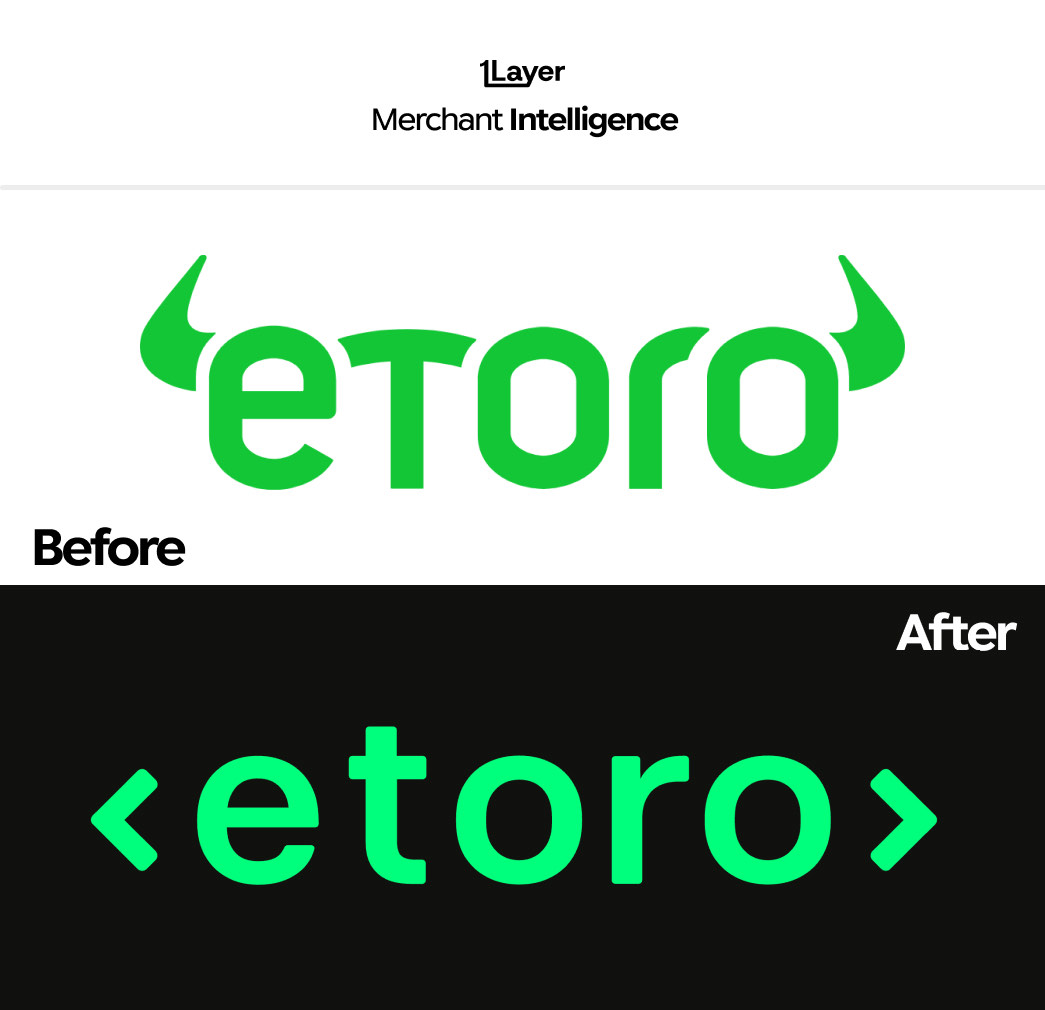
eToro has retired the bull. The horns that framed the wordmark for years are gone, replaced by a pair of angle brackets, a brighter green, and a lowercase wordmark drawn to sit on black. It is the most decisive rebrand the company has run, and it says a lot about where trading platforms think they are heading.
What changed in the new eToro logo
- The bull horns are gone. In their place, angle brackets — a code and terminal reference rather than a market one.
- A brighter, more saturated green that holds up on dark backgrounds instead of washing out.
- A cleaner geometric lowercase wordmark, with more even letterforms and a squared-off "t".
- Dark-first presentation: the mark is now shown on black by default rather than on white.
Swapping a bull for angle brackets is a positioning statement. It moves the brand from "markets" to "infrastructure".
Why a logo change is a data problem
For any product that lists transactions, a rebrand is not a design story — it is a freshness problem. The day eToro ships a new mark, every cached copy of the old horns sitting in a transaction feed is wrong. Customers spot it immediately, and the fix rarely reaches the top of anyone’s backlog.
- A stale logo makes an otherwise correct statement look neglected.
- Trading and brokerage brands often settle under several acceptor strings and entities, so the same asset has to update in more than one place.
- Manually curated logo libraries drift fastest where brands change most: fintech, retail, and travel.
The takeaway
eToro’s refresh follows the same 2026 pattern as everyone else: fewer illustrative elements, higher contrast, and a mark that is drawn for a dark app row rather than a billboard. If your product shows merchant logos, assume several of your best known brands will do the same this year.
Frequently asked questions
What is the new eToro logo?
eToro’s 2026 logo is a lowercase green wordmark framed by angle brackets, replacing the bull horns used previously. It is presented primarily on a black background.
Why did eToro remove the bull from its logo?
The bull was a markets reference. The angle brackets read as code and infrastructure, which reflects a platform positioning rather than a pure trading one.
Did eToro change its brand colour?
The brand stays green, but the new green is brighter and more saturated so it holds contrast on dark backgrounds and at small sizes.
How do banking apps keep merchant logos up to date after a rebrand?
Either by manually curating a logo library, which drifts quickly, or by using a merchant enrichment provider that refreshes logos continuously and serves them at a consistent resolution.